8 tips to make your Instagram feed pretty damn flawless!!

You have a very limited amount of time to grab someone’s attention and pull them in, and a visual strategy helps you do this. An Instagram feed should constantly be pulling in new followers, not just when you’re on the platform actively engaging🔱
That is entirely predicated on how your feed looks and how your content performs even while you’re away from your device! ğŸ™ğŸ½ğŸ”®
PS: You don’t need to be a blogger to have a faiiineee feed”¼ğŸ˜Š
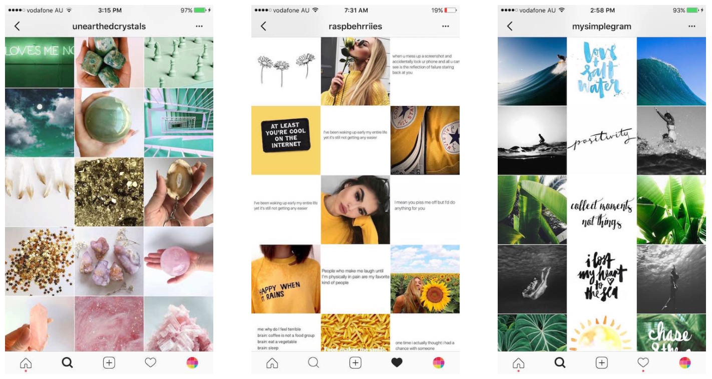
Firstly, you can make your feed HOWEVER you want it to be. It can ENTIRELY be a certain category, such as, food, fashion, products, coffee shots, desserts, selfies or a great mix. Or you maintain a certain theme, a certain color, all flatlays, warm feed, entirely illustrations based or a certain shape (refer to the below image).
The first bit is easy but the latter can be a bit confusing. That’s where I’ll be helping ya! 😀ğŸ’

Before I commence, I would like to let you know about MY Instagram Feed @naomi_dsouza. I don’t have a set ‘feed’! If you scroll through my Instagram, you will notice I keep changing the theme, it’s sometimes super colorful, blue, sober, dark or just… nothing 😆 This happens because of a few reasons,
- I’ve tried sticking to one theme, but this restricted me from posting content I wanted to post. I am a lifestyle blogger, dominantly food (i.e. I get invited to dim-lit/dark/bright/pink/yellow hue lit restaurants all the time). Although it’s easy to stick to one theme, I know I’ll be sacrificing on a lot of content just cuz it doesn’t ‘fit in’
- I find it easier to stick to a theme while I’m traveling. For e.g. while I was at Maldives, my feed was blue and when I was at London, it was very ‘city-like’
- I don’t have the time to overthink what goes where all the time 😂 if I look good or I’m doing something exciting, I just want to post it and get done with it! Overthinking your feed will either drain you or just restrict your content *drastically* 😫
All things said and done, I still try to keep it aesthetically appealing (at least I think it is)? 😛
Method 1 – The Lifestyle Content Plan
This is the method I use most of the time! I don’t want my feed to look like I post about food all-the-time! Strategise your content this way and manipulate this formula/plan based on your discretion.

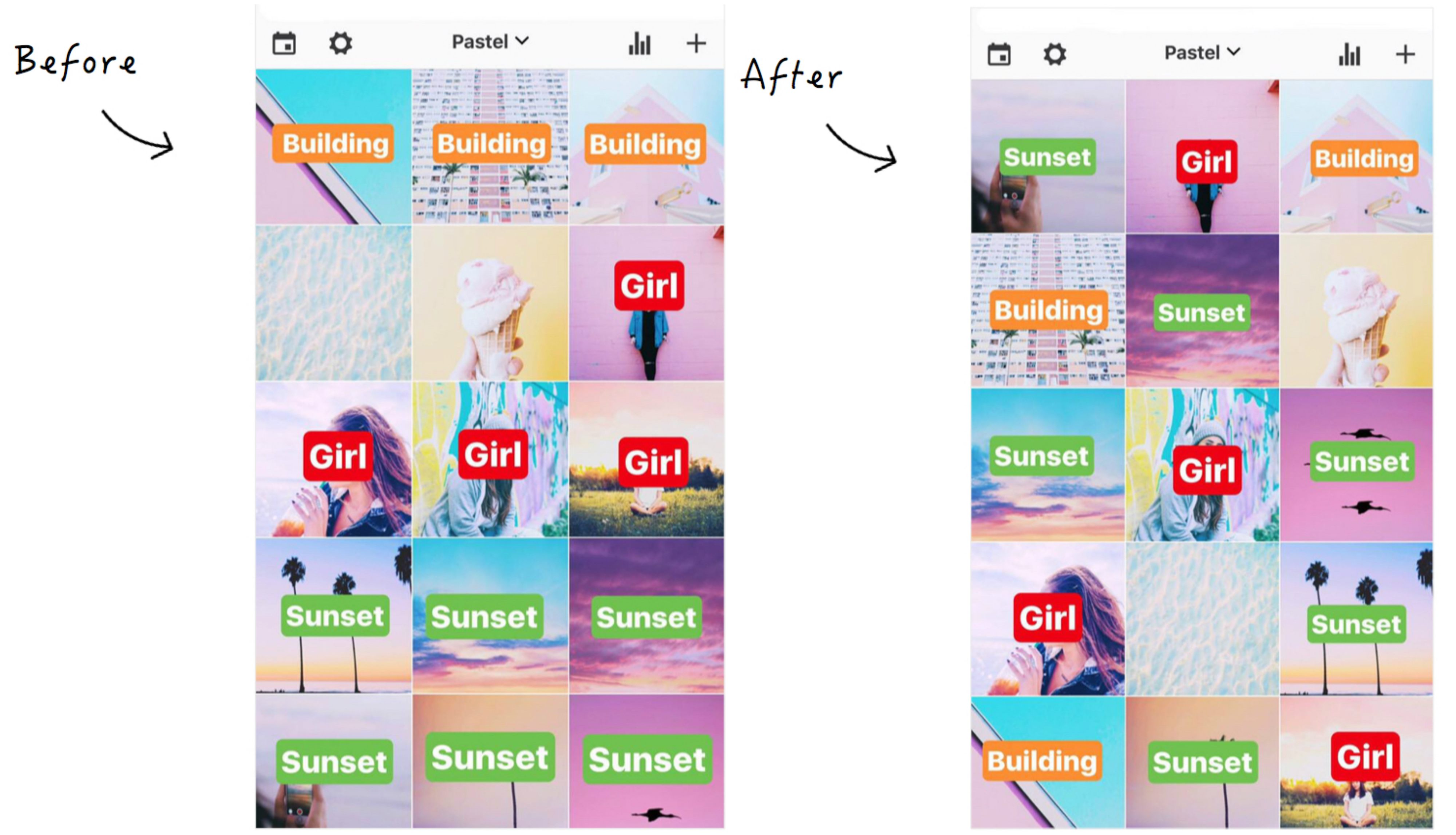
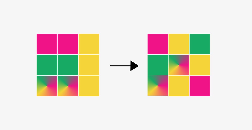
If you put the same category of pictures in one row, it will look odd. Ensure photos with similar content and depths aren’t touching either next to each other OR on top of one another. If you want to divide one category and don’t know what to post, just pop in a selfie 😉
Method 2 – Go Diagonal
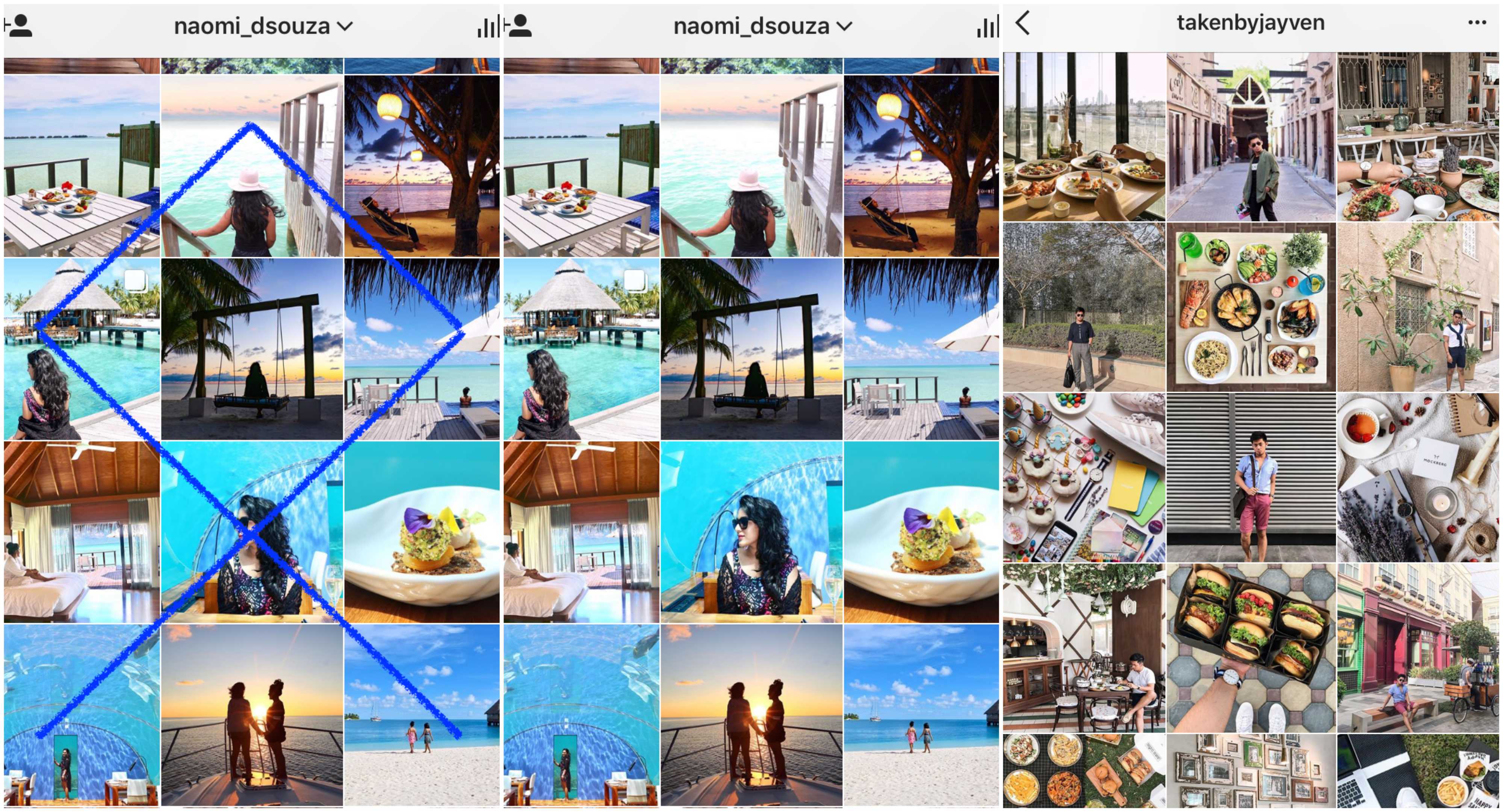
When I want my feed to look a particular color, I go diagonal! Yes, Maldives is dominantly blue, but not every nook and corner is blue right?! I avoided putting 2 blue pictures together cuz if I did, the next brown or green picture, destroyed my feed! Thus, I strategically alternated and placed blue pictures after another off color. Makes sense? 😄
Additionally, look at Jayvens pic on the extreme right. He strategically alternates his portrait shot in a similar fashion. Had he put his picture or a food shot twice in a row, it’d either look like he’s obsessed with himself or he’s concentrating on one form of content only.
Method 3 – Go Horizontal or Vertical
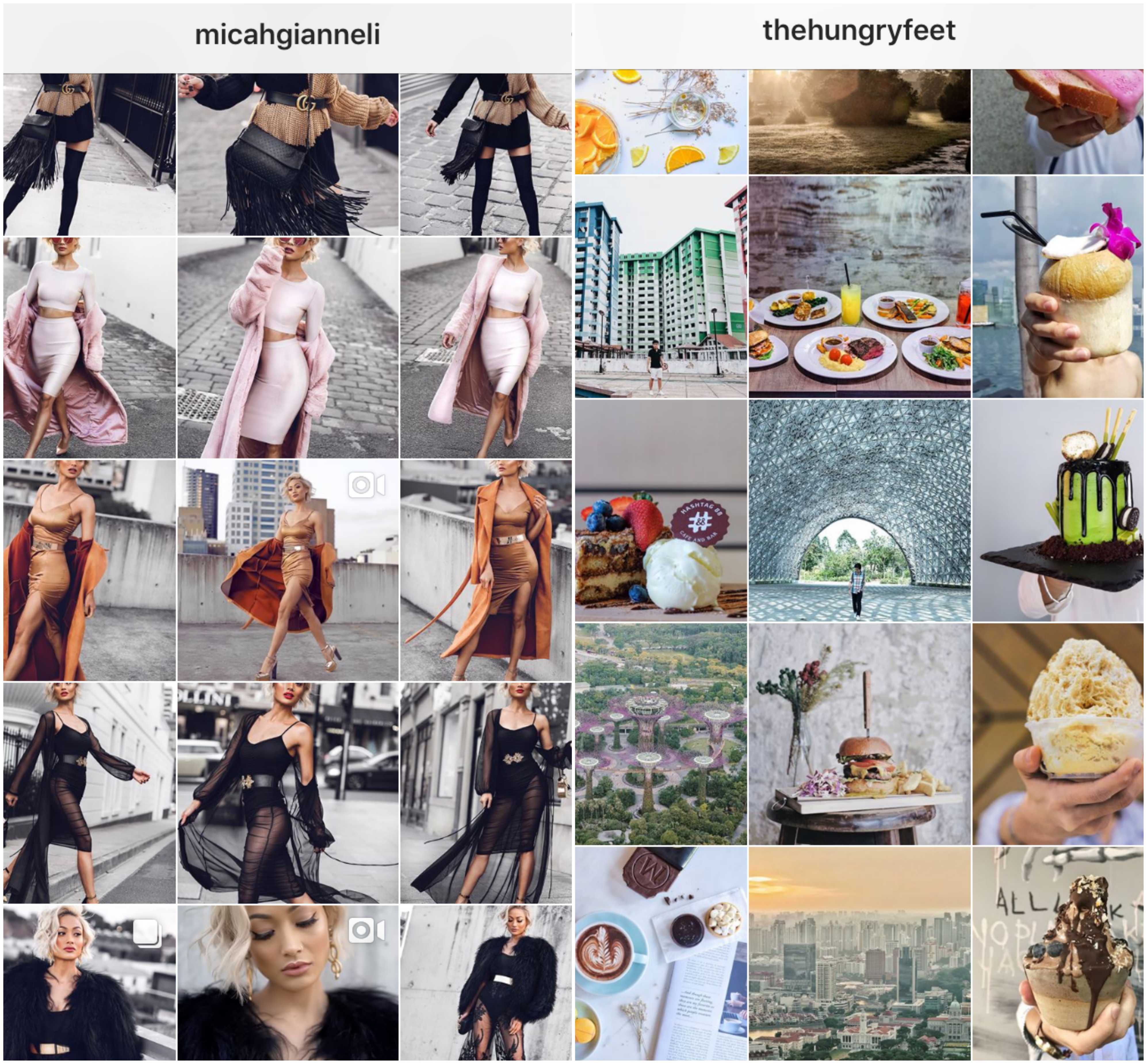
If you’re a fashion blogger and post a lot about your outfits (AND want to show different angles), I suggest you go Horizontal! This way, everything you want to show, can be displayed neatly and if you’re known for something unique like sharing quotes or are known for having a creative way of taking pictures you can go vertical just how The Hungry Feet did (if this type of feed appeals to you) 😉
Method 4 – Consistent Background Colors
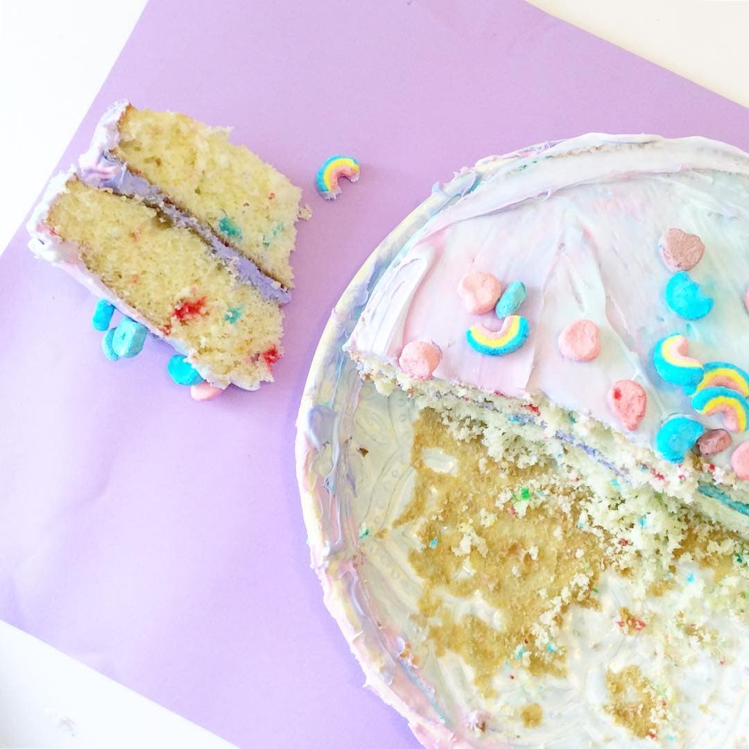
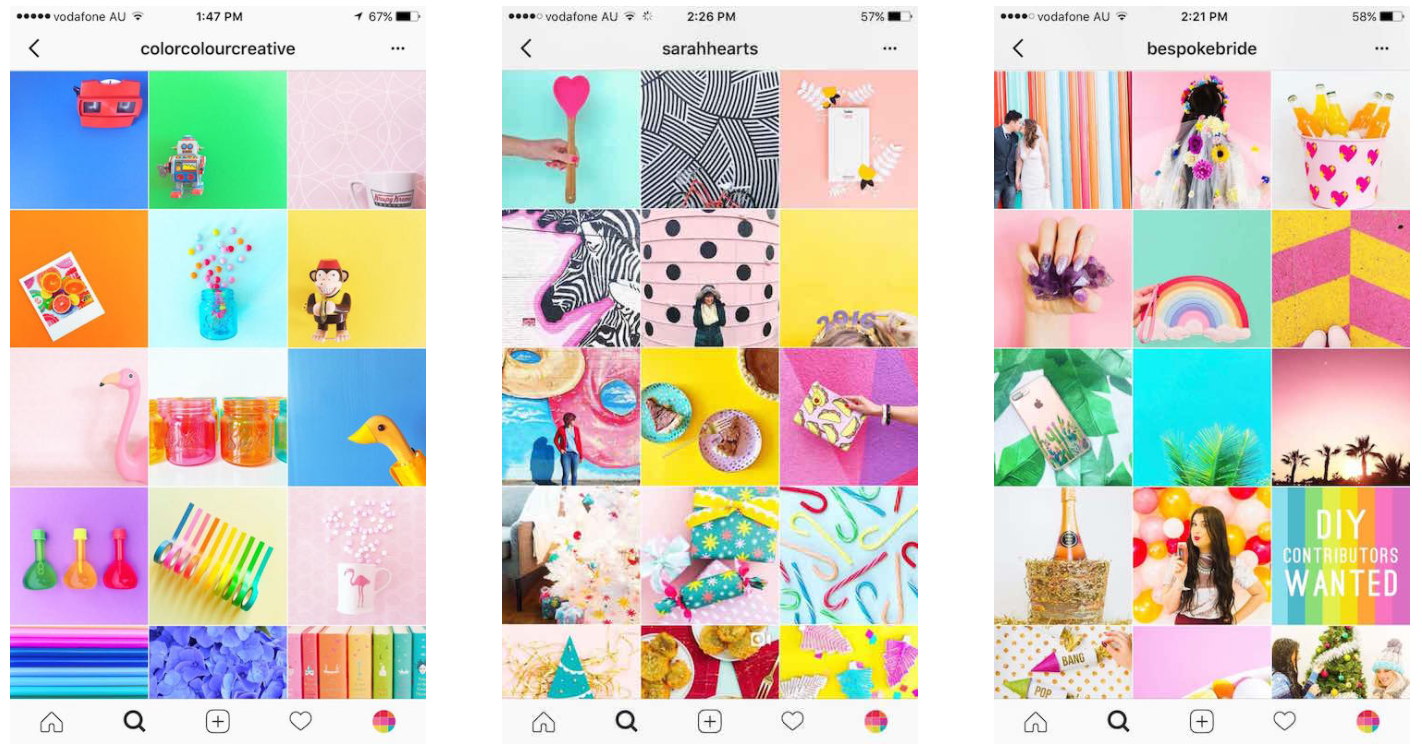
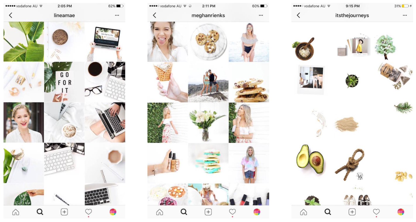
If you’re the type who’s all bout consistent background colors. Get a bunch of pastel colored chart paper, marble finishing or wood backdrops for your pictures and your feed will end up looking like the below!
Method 5 – The same filter and tint trick
Filter = Style of your feed
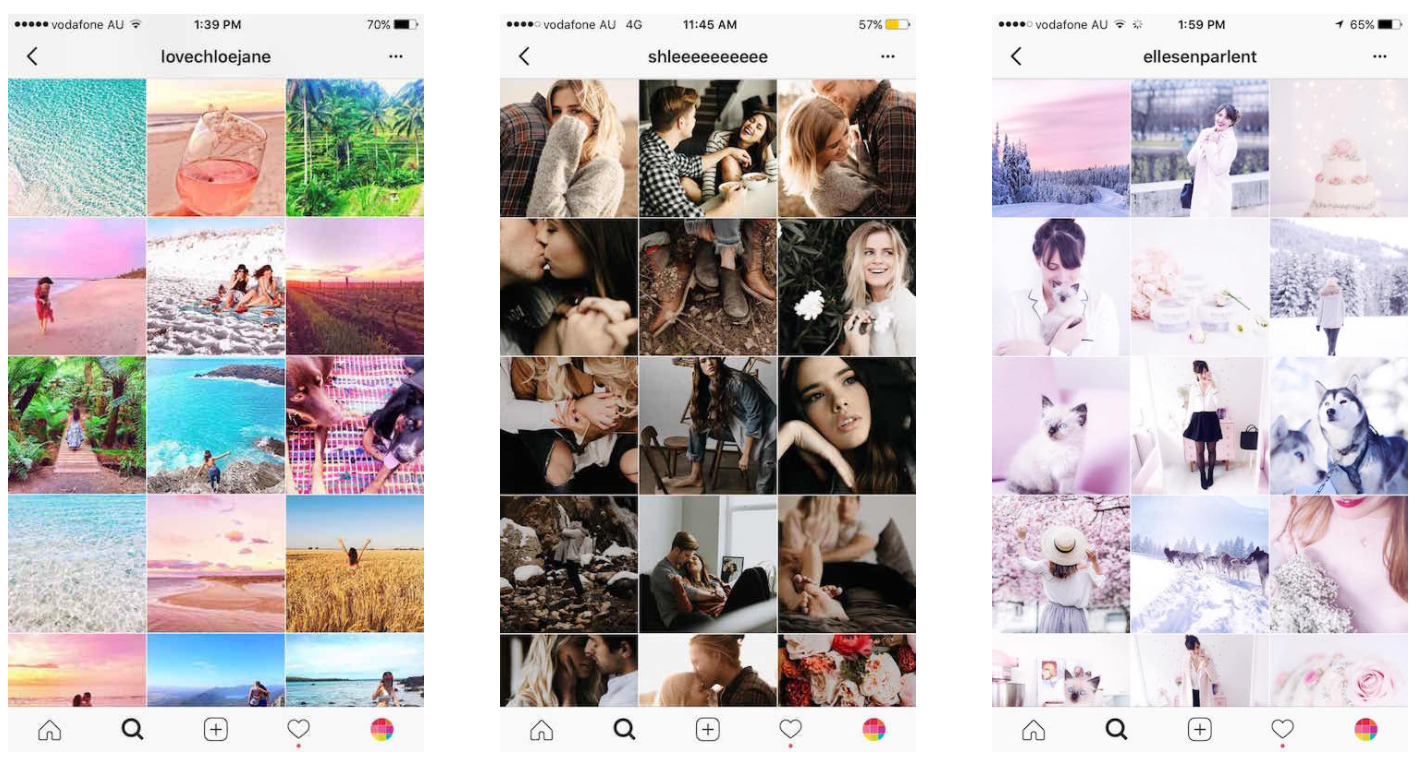
If you use the same filter and same tint color on every single picture. Your entire feed will look like that itself. It will be an easy theme to maintain and will make your overall feed look cohesive when someone looks at your feed for the first time. Also, the same filter gives an overall mood to your whole feed. So choose wisely based on the type of photos you take!
Method 5 – The dark or bright theme
I personally feel this is one tough theme to maintain consistency!
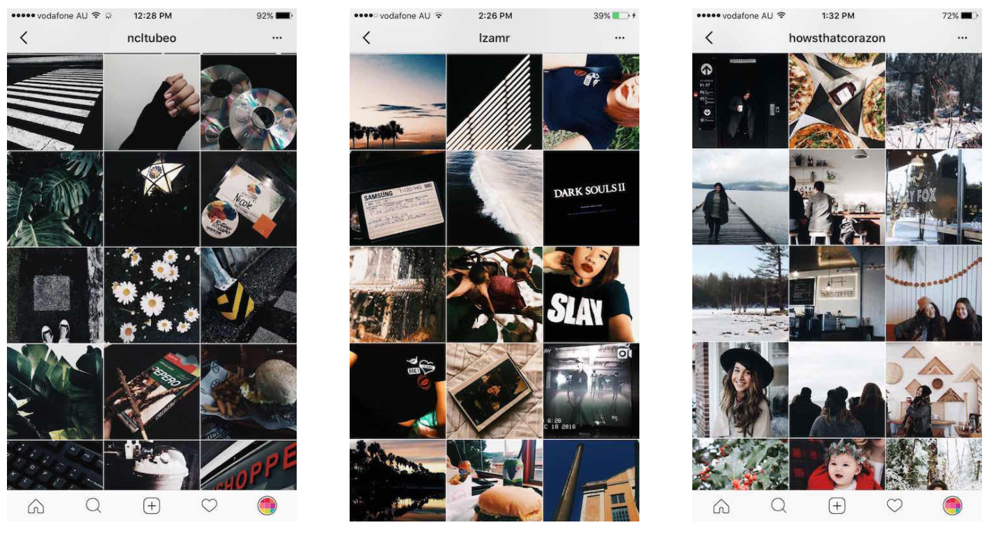
- A very mysterious and beautiful feed but if you want a dark feed, every image must have low exposure or brightness. If you want a faded profile keep it at low contrast.
- Keeping a white minimalistic theme is not easy! You will always need PERFECT lighting or amazing editing skills. You will also always need to carry white props with you. Such as a white cloth or chart paper (yes people do that)…
Method 6 – The ‘One Thing Only’ theme
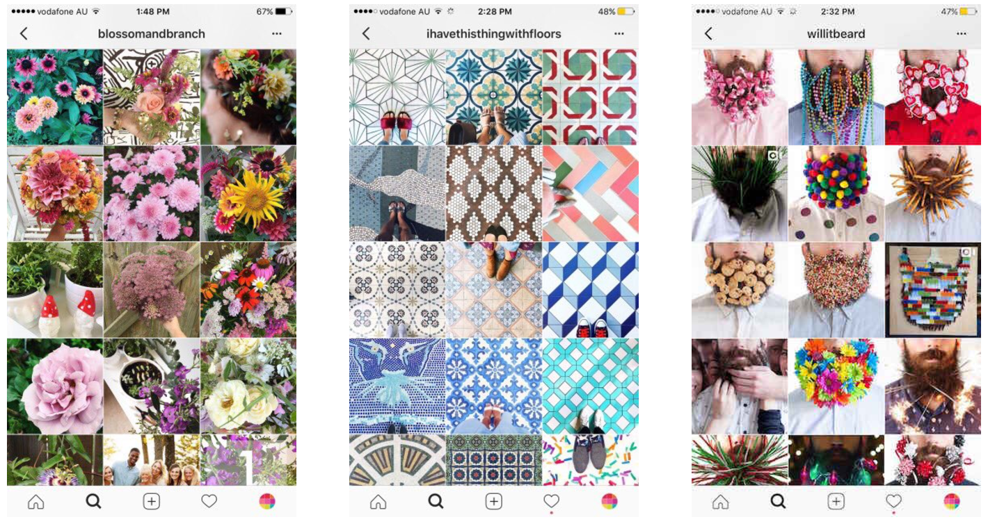
I’ve seen people post ONLY about mushrooms, washrooms, flowers, tiles, beards, etc! So if you have a passion for one thing, you could consider that while planning out your feed 😇
 Method 7 – VSCO
Ah, yes… I had to touch on this topic! Thank me later 😉😉😉
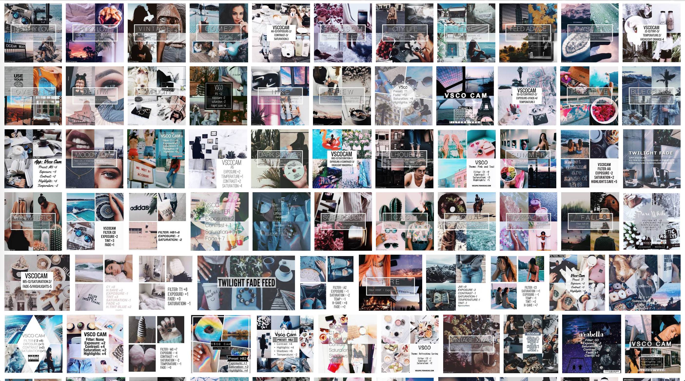
There are 100’s of themes you can choose from (refer to the image below) 😵😵 A LOTT of practice is required to perfect the presets mentioned below.
Download the app here.
Click the below hyperlinks to view all types of presets I’ve found for you!
Method 8 – Perfect Edits
Keeping all the types of themes aside, if you have good pictures, you need no theme 🤔 Refer to the below tricks and click here to view all the editing apps I use to edit my pictures!

Last but not least, I would like to add that people (myself included) can’t always relate to people that have a PERFECT Instagram feed. Perfect is not real according to me and probably that is why a few bloggers end up losing followers?
Globally, many bloggers have now started using the hashtag #FreeUpMyInsta – a revolution started by Allison Sadler. She came up with the idea to encourage people to add a slice of reality to their grids. It’s about being able to create and share whatever you want without worrying about getting likes or gaining followers, y’know?! 🙂 She says, “I decided to launch the #freeupmyinsta photo challenge because I was feeling bored and uninspired by seeing the same type of image again and again on Instagram. We are constantly being told how to improve what we share to win on social media and I think the pressure for people to follow a ‘formula’ and beat the algorithms had started to quash creativity and take the fun out of sharing” which is so true!!
I hope you guys liked this blog post â¤â¤â¤ I spent a lot of time creating it although it mayyy not seem like it… 😊😊
Sources


